The strategy behind Comet's rebranding: moving from a functional brand to an affinity brand, warmer and centred on collaboration.
In recent years, rebranding has emerged as a powerful strategy for companies to bring themselves up to date, align fully with their own development and stay entirely consistent with their positioning and their new offers. Seen in that light, rebranding is a natural and responsible answer to those challenges.

One of the benefits sought through rebranding is to highlight a brand's current strengths and attract new clients by standing apart from its main competitors. It can support the company's growth by strengthening its influence in a highly competitive market and deepening customer attachment. Keeping message, image and customer experience consistent also helps build a solid, recognisable brand identity that fosters trust and credibility with the target audience.
Comet, a leading player in office real estate specialising in hospitality, is celebrating its recent rebranding, and here is why.
After seven years of growth and expansion, the company, which champions productive meetings in welcoming and inspiring work environments, paused to take stock: what do its clients value most? In-depth work showed that clients like the company for its personalised approach and sense of service, expressed through a set of thoughtful touches that make them feel special.
That human character had to be reflected in the brand. The aim of the rebranding was therefore to move from a functional brand to an affinity brand, with a warmer, more human identity centred on collaboration. In doing so, the company seeks to build deeper emotional bonds with its clients, emphasising the sense of belonging and camaraderie they feel when they experience Comet.

Its shapes have changed radically, leaving rigid lines behind in favour of rounded, soft forms that convey the closeness, comfort and care that define the human experience in its spaces. Yellow has also taken centre stage, echoing the warm atmosphere in harmony with the natural light that fills its venues and expressing a more dynamic, energetic spirit.
Comet's new look was led by the design agency Seenk, known for its campaigns for major brands such as Lacoste and BNP, working alongside the company's internal teams. The name “COMET” was kept because it reflects its collaborative essence, and the new logo brings together “co” and “met” to symbolise the importance of collaboration in an inspiring, productive environment.
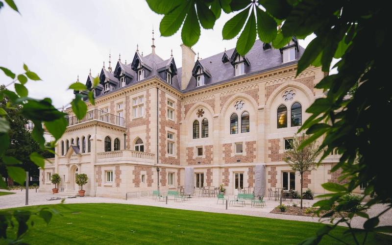
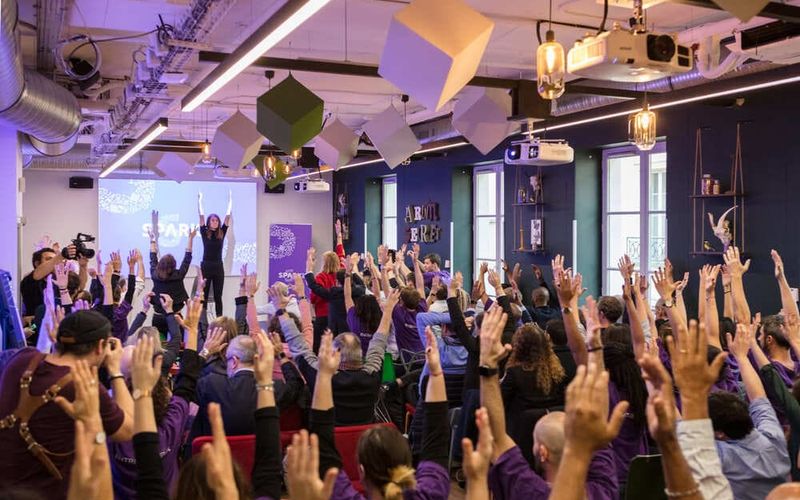
Comet's rebranding project goes beyond a simple aesthetic change: it is an opportunity to reflect the warm, welcoming and detail-minded approach the company has cultivated throughout its growth. Comet wants to encourage teams to come together in inspiring, light-filled spaces where experiences are genuine and rewarding. Drawing on the hospitality standards of the hotel industry, the company aims to bring an equally welcoming atmosphere and a customer-focused approach to the venues it operates. By building that sense of hospitality into its offers, it works to establish lasting relationships that support productivity and wellbeing at work.
In short
Comet, a leading player in office real estate specialising in hospitality, is renewing its identity to underline its commitment to collaboration and distinctive experiences. After seven years of expansion, it keeps its name and combines “co” and “met” in its new logo to symbolise the importance of inspiring encounters. Yellow replaces cyan, conveying warmth and joy, while the rounded typography reflects the human dimension. More than an aesthetic change, the rebranding sets out to promote genuine, rewarding meetings in light-filled spaces. Led by Seenk, the project involved all of Comet's internal teams.