Following a YouGov survey of 1,000 Belgian workers, Comet updates its brand identity and fully embraces its hospitality craft.
According to a Comet survey carried out by YouGov among 1,000 Belgian workers, nearly one respondent in two would like to see their colleagues more often. In fact, 37% of them believe remote work can have a negative impact on their personal and professional fulfilment. Faced with this new reality of work organisation, the hybrid work expert is today announcing an update to its brand identity.
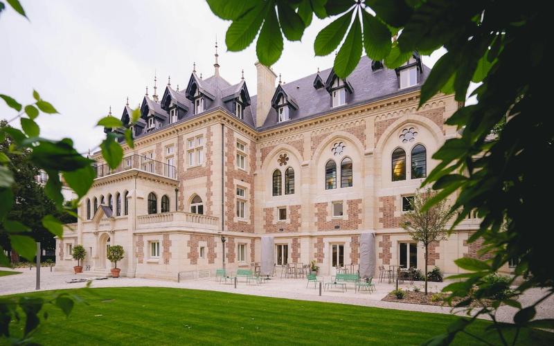
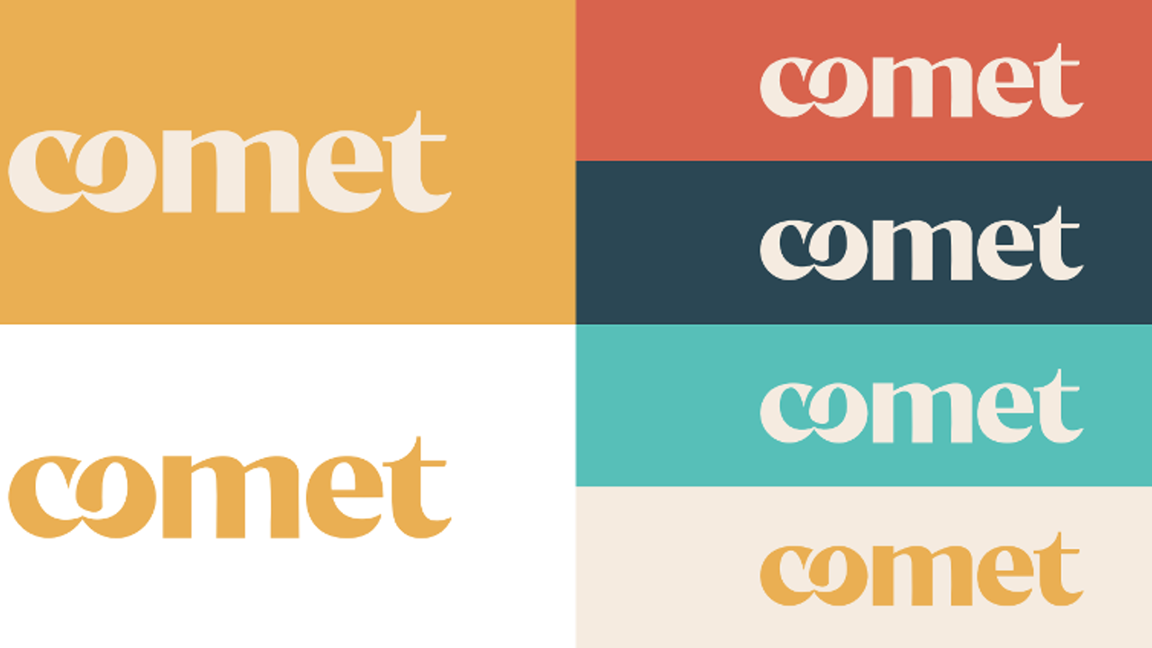
Comet moved into meeting venues and events in 2016. First a real estate player, the company sees in the results of its new study an opportunity to refocus its identity on its service craft: welcoming and supporting its clients. It is now adopting new visual guidelines designed with creative agency Seenk. This new design reflects Comet's DNA as a hospitality player and highlights the high added value of its services.
A new face for a repositioning built on hospitality
After seven years in business, the opening of spaces in three European markets and the successful launch of three complementary offers (Comet Meetings, Comet Workplaces and Comet Hospitality), Comet is reaffirming its identity. In its early years, the collaboration expert grew as an innovative player in office real estate. The brand established its position by proving its reliability and creativity, reflected in its original visual identity: light blue and straight-lined, like skyscrapers. Today, in the light of its journey, Comet draws on other sectors such as the hotel industry and opens new horizons by embracing its hospitality craft, a business built on being there in person and on human-to-human relationships, which relies heavily on service, care and closeness. At a time when office real estate is facing an unprecedented global crisis, clients choose Comet for its on-site teams and for welcoming venues where they feel special, energised and stimulated. Convinced of the value of the collective, Comet's role is to bring professionals together in a world that tends to keep them apart.
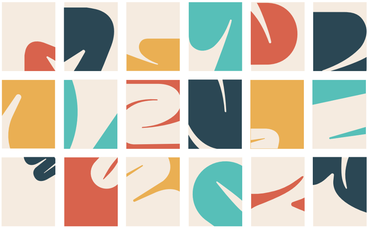
To that end, Comet's new visual identity rests on three essential pillars:
- YELLOW: a bright, dynamic colour underlining that each of its venues is warm and filled with daylight.
- ORGANIC SHAPES: as in the hotel industry, the company's wealth lies first and foremost in its people. Its brand is human.
- COLLABORATION: “co” becomes Comet's new symbol and the foundation of its core values. The company is convinced that collaboration, cohesion and the collective are the key ingredients of our societies, and of our companies in particular.
Victor Carreau, CEO and co-founder of Comet, welcomes the change: “Yes, the world of work has changed. Today anyone can work on their own, from anywhere in the world. But in the end, nothing has really changed: a company remains a human adventure, one in which everyone has to find their place and for which people want to come together. So if we see each other less, let us see each other better. Video calls must not get in the way of conviviality.”
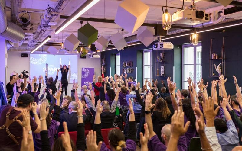
Claire du Boislouveau, Head of Communications at Comet, adds: “While we remain a real estate player, it is striking that our clients come and come back mainly for the support we give them. It was time for that closeness to show in our visual identity, because ours is above all a service business, person to person. Comet welcomes every kind of organisation for an enhanced collaborative work experience. Our venues are designed to foster creativity and exchange. Day to day or on special occasions, our spaces will spark something. We are here so that every collective moment is the start of progress, and to cultivate the pleasure of being together.”
Survey methodology
The survey was carried out among a representative sample of the working population (aged 18 and over) in Belgium (n = 1,017), France (n = 1,005) and Spain (n = 1,020). It was conducted online, on YouGov's proprietary panels, from 4 to 10 July 2023, using the quota method.